A gradient background transitioning from deep navy on the left to vibrant teal on the right, with hints of magenta and purple at the bottom. This background appears to be used as a visual asset or hero section backdrop.

Digital Experience & Donation Optimization

Donation Flow Optimization

Donation Flow Optimization

WordPress CMS

WordPress CMS

Content Strategy

Content Strategy

A mobile screen displaying the SickKids donation payment interface. The form offers both “Monthly” and “One-time” options. Donation amounts include $50, $100, $250, or a custom amount. Users can dedicate their donation and choose a payment method: Apple Pay, Google Pay, PayPal, or Credit Card.
A gradient background transitioning from deep navy on the left to vibrant teal on the right, with hints of magenta and purple at the bottom. This background appears to be used as a visual asset or hero section backdrop.

Digital Experience & Donation Optimization

Donation Flow Optimization

WordPress CMS

Content Strategy

A mobile screen displaying the SickKids donation payment interface. The form offers both “Monthly” and “One-time” options. Donation amounts include $50, $100, $250, or a custom amount. Users can dedicate their donation and choose a payment method: Apple Pay, Google Pay, PayPal, or Credit Card.

Increased

donation speed and average donation value

Increased

donation speed and average donation value

Increased

donation speed and average donation value

Higher

monthly donor conversions via smart prompts

Higher

monthly donor conversions via smart prompts

Higher

monthly donor conversions via smart prompts

100%

AODA Level AA compliance

100%

AODA Level AA compliance

100%

AODA Level AA compliance

200+

accessible, branded UI components

200+

accessible, branded UI components

200+

accessible, branded UI components

The Opportunity

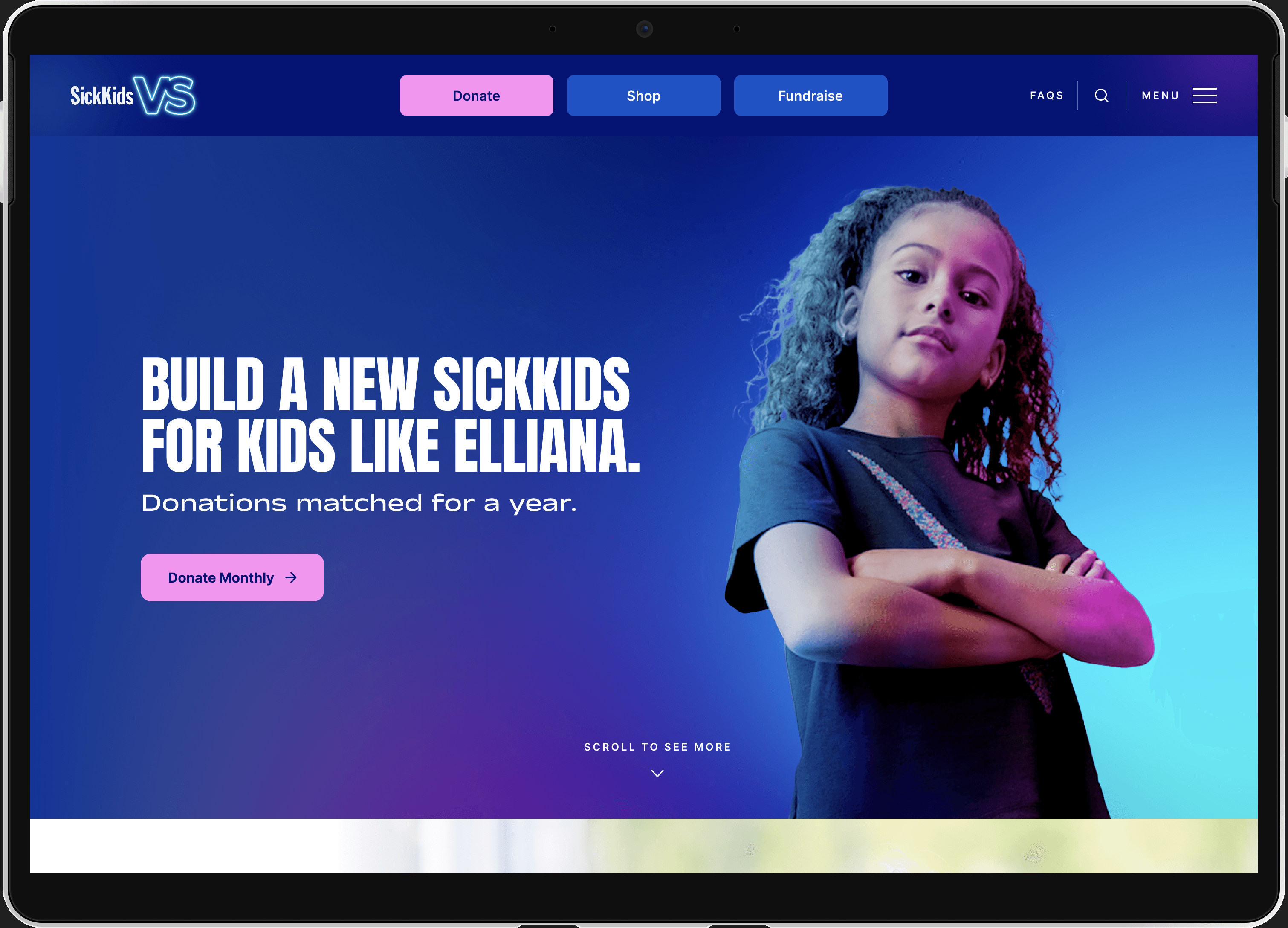
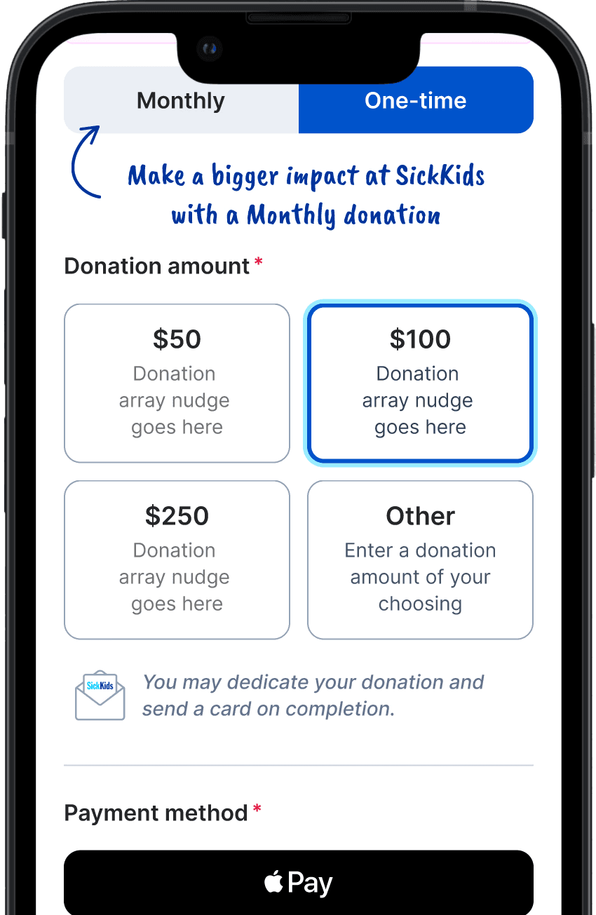
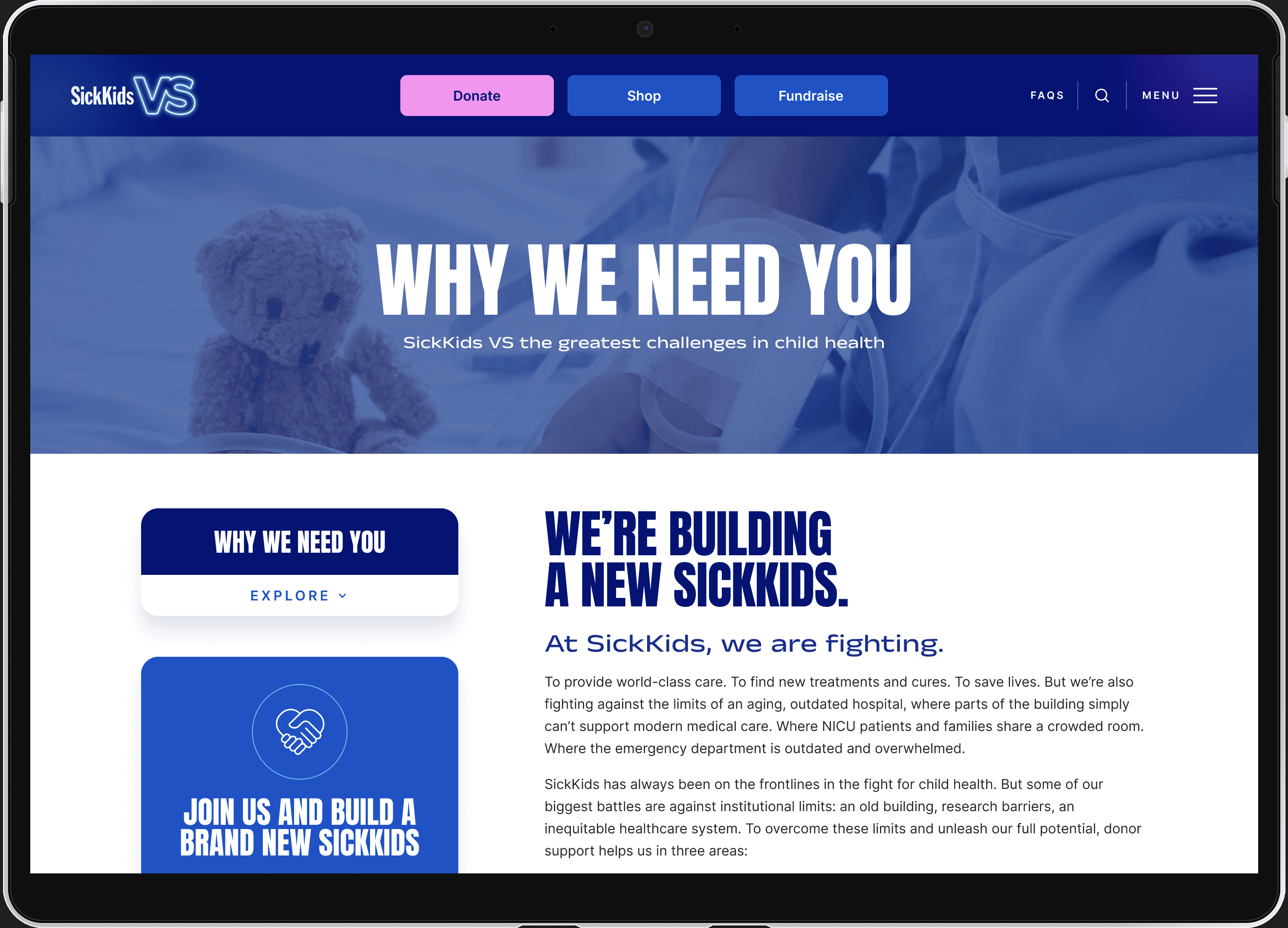
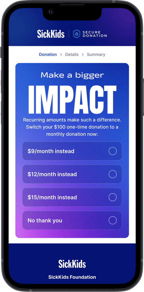
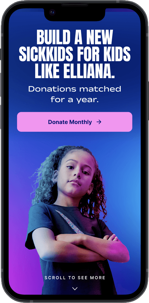
SickKids, Canada’s leading children’s hospital and a globally recognized research institution, relies heavily on digital donations to support its work. Initially, they came to us with a focused need: optimize their donation flow to improve conversions. After the success of that work, they returned following a major rebrand, looking for a partner who could bring their updated visual identity to life in a way that was both digitally functional and fully accessible. The challenge was clear: preserve the energy of the new VS campaign, enhance usability, and ensure AODA compliance, all within a flexible, scalable digital system.

Tablet screen showing the SickKids campaign page titled “Why We Need You.” The page outlines the foundation’s mission to build a new hospital and explains key challenges in pediatric health care that donations will help overcome.
A mobile screen prompting the user to switch their $100 one-time donation to a monthly contribution. Options include $9, $12, $15 per month, or declining with “No thank you,” under the message “Make a bigger impact.”
A mobile screen displaying the SickKids secure donation form. It collects personal details for tax receipt purposes including donation type, pronouns, name, and email. A checkbox at the bottom offers information about supporting SickKids through a will.
A mobile screen showing a SickKids donation confirmation page. It thanks the donor, summarizes the donation amount, email, and payment method, and provides a button to dedicate the donation in honor or memory of someone.
A full-screen SickKids donation appeal showing a confident young girl with folded arms. The text reads: “Build a new SickKids for kids like Elliana. Donations matched for a year.” A pink button invites users to “Donate Monthly.”

Strategy

We began by mapping the builder’s service model, audience segments, and geographical coverage. It was clear that local visibility and project storytelling were key. The strategy focused on three pillars:

01

Showcasing craftsmanship

through visual case studies and finished project galleries

01

Showcasing craftsmanship

through visual case studies and finished project galleries

01

Showcasing craftsmanship

through visual case studies and finished project galleries

02

Improving local search visibility

with geo-targeted content for the specific towns and regions they serve

02

Improving local search visibility

with geo-targeted content for the specific towns and regions they serve

02

Improving local search visibility

with geo-targeted content for the specific towns and regions they serve

03

Streamlining the site architecture

for faster discovery of services, expertise, and contact options

03

Streamlining the site architecture

for faster discovery of services, expertise, and contact options

03

Streamlining the site architecture

for faster discovery of services, expertise, and contact options

We also ensured that content flexibility and SEO-readiness were built in from day one.

Execution

We delivered a fully accessible, modular design system for SickKids Foundation, centered on mobile-first UX, performance, and long-term sustainability. Every element was built to optimize donations and empower the internal team to scale with ease.

Key build features included:

Built 200+ modular components with accessibility standards baked in from the start.

Streamlined one-time and monthly giving with urgency cues and simplified decision paths.

Enabled Apple Pay, Google Pay, and PayPal to reduce checkout friction.

Achieved full AODA Level AA and WCAG 2.1 compliance across devices.

Designed for varied campaign needs without sacrificing usability or speed.

Tablet screen showing a donation thank-you page from SickKids. A young child holds a celebratory sign that reads “Nori is done immunotherapy!” with the message “Thank you, Alison” and donation summary details on the right.

Insights & Evolution

This engagement reinforced the value of design systems over static deliverables. By pairing brand integrity with accessibility and UX logic, we helped SickKids move beyond the limitations of one-off builds and toward a system that’s scalable, testable, and fully future-proof.

Tablet screen with a SickKids campaign hero image featuring a confident young girl and bold text: “Build a new SickKids for kids like Elliana. Donations matched for a year.” A pink “Donate Monthly” button is prominently featured.

Looking to translate your brand into a scalable, accessible, conversion-ready digital system?

Let’s build something that performs beautifully, for everyone.

Looking to translate your brand into a scalable, accessible, conversion-ready digital system?

Let’s build something that performs beautifully, for everyone.

Looking to translate your brand into a scalable, accessible, conversion-ready digital system?

Let’s build something that performs beautifully, for everyone.

© 2025 Fuel Media Inc. An SDI Company.

Accessibility

Privacy + Terms

© 2025 Fuel Media Inc. An SDI Company.

Accessibility

Privacy + Terms

© 2025 Fuel Media Inc. An SDI Company.

Accessibility

Privacy + Terms