Our systems are mapped with clear dependencies, accessibility baked in, and content structured for both clarity and performance. We collaborate with developers, marketers, and internal teams to ensure our tools function across platforms—and across time.
From readiness checklists to design tokens, we make sure your tools don’t just launch, they last.
What We Offer
01
UI/UX Design
Thoughtful interfaces built around your users.
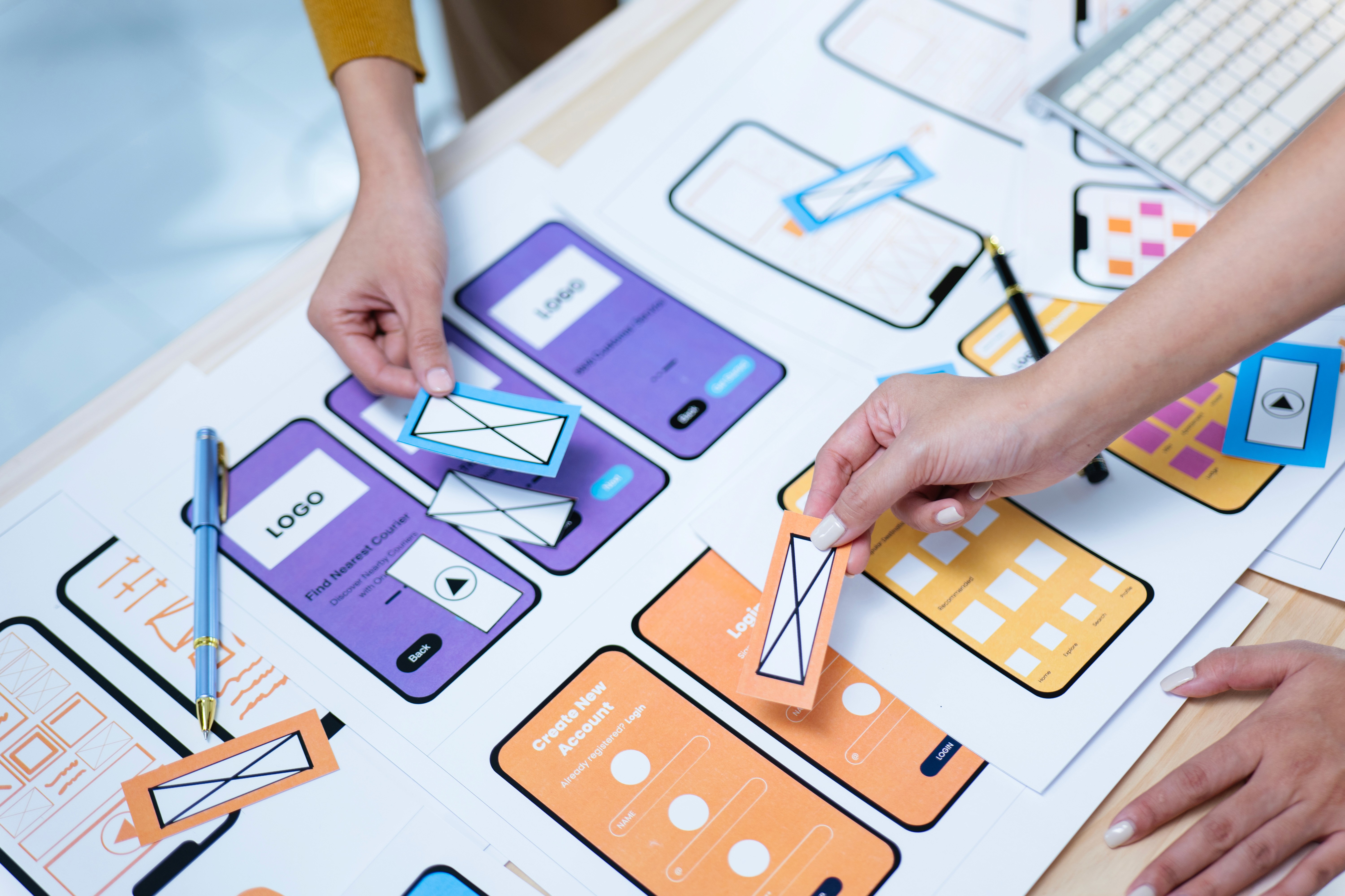
Collaborative wireframing and layout planning
UX research and content modeling
High-fidelity prototypes
Mobile-first and responsive design best practices
User-focused microinteractions and navigation flows
Whether you’re designing a new platform or improving an existing one, we help streamline and humanize your experience.
02
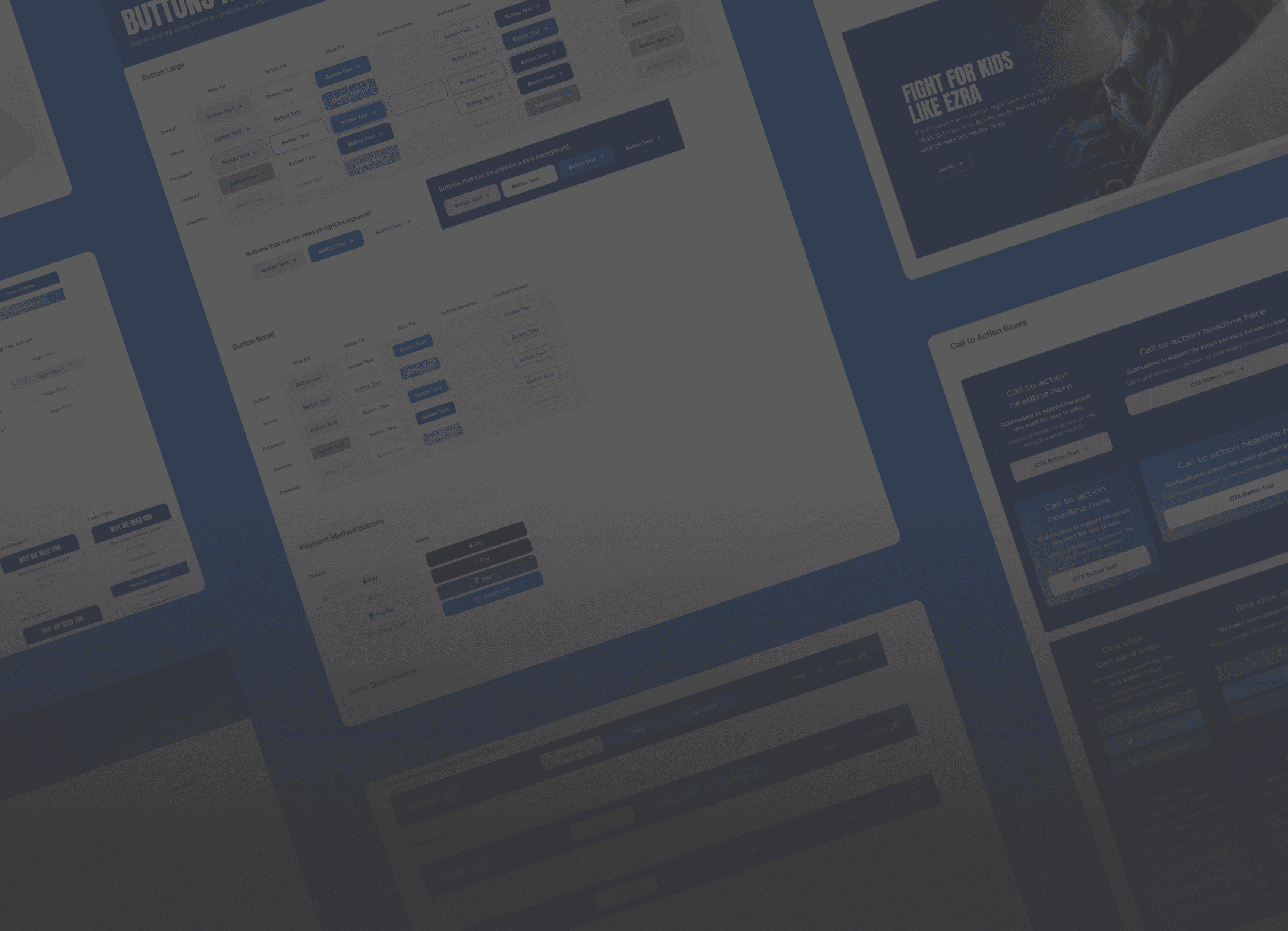
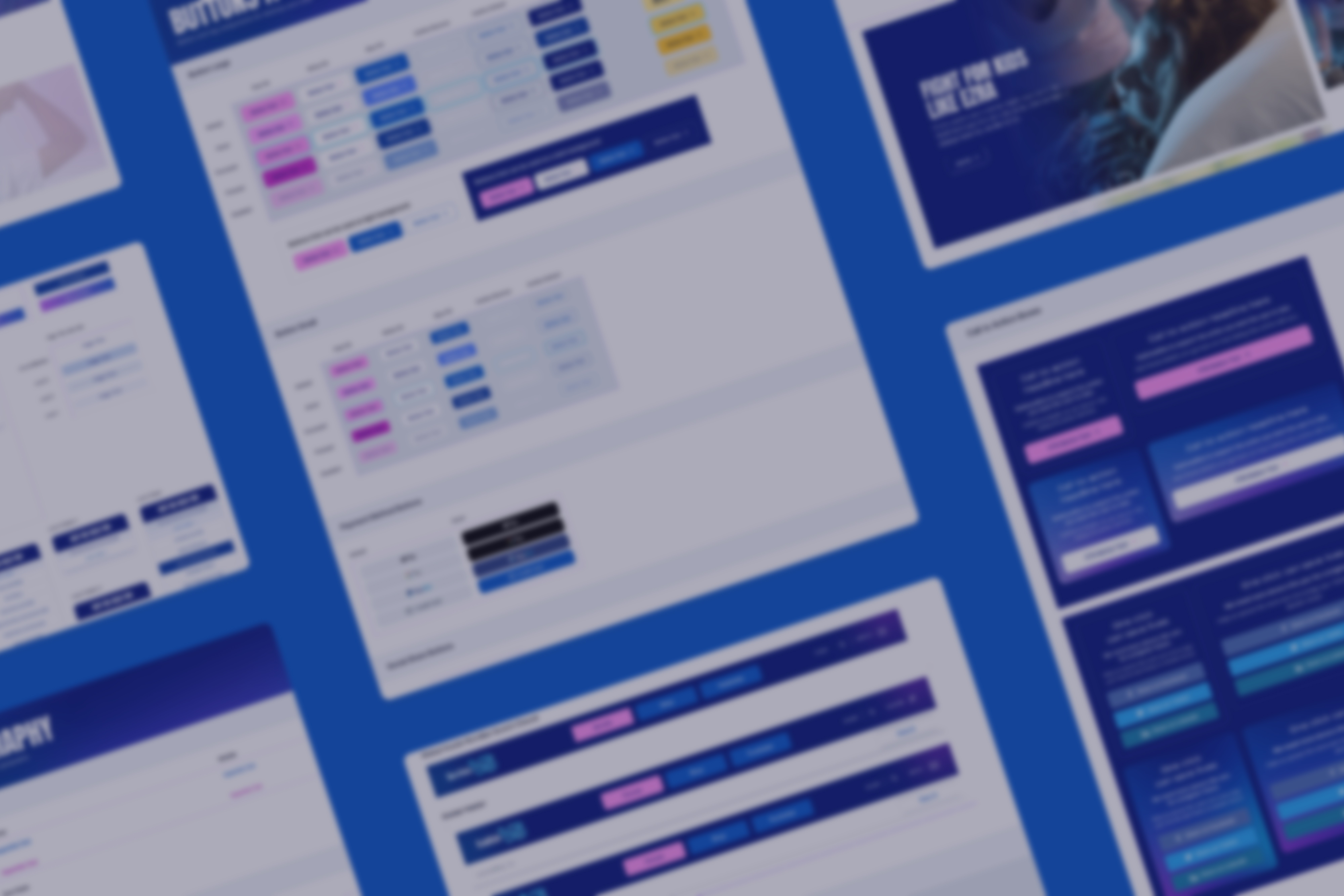
Design Systems
Design once. Reuse everywhere.
Component libraries with documentation
Colour and typography tokens
Scalable layout grids and patterns
Accessibility standards baked in from the start
Developer-ready files and handoff specs
Our systems are clean, flexible, and easy for in-house teams to maintain—even as your digital products evolve.


Our Process

01
Discovery
We identify user goals, project constraints, and technical context.
02
Structure
Wireframes and UX flow mapping to define the core experience.
03
Design System Setup
Reusable styles, tokens, and components created in Figma.

04
UI Design & Prototyping
Branded, accessible layouts built for real use on desktop and mobile.

05
Handoff or Build Collaboration
We support internal dev teams or carry the design through to a custom build.
Good Systems Save Time. Great Systems Grow With You.
By setting up scalable foundations, your team can move faster, stay on-brand, and avoid rebuilding from scratch every time.
This is especially valuable if you:

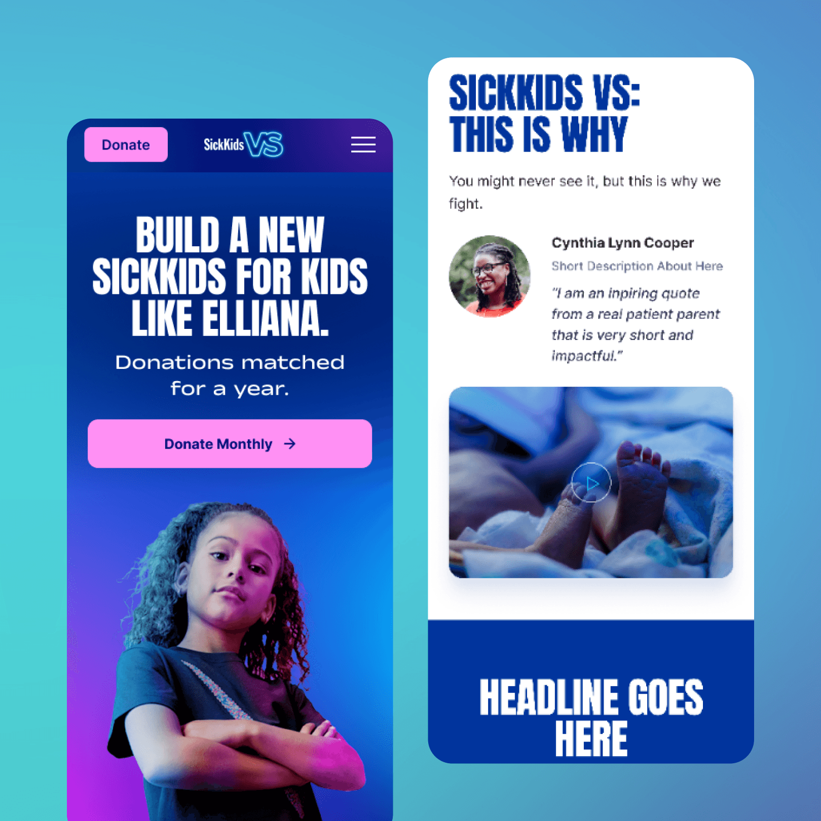
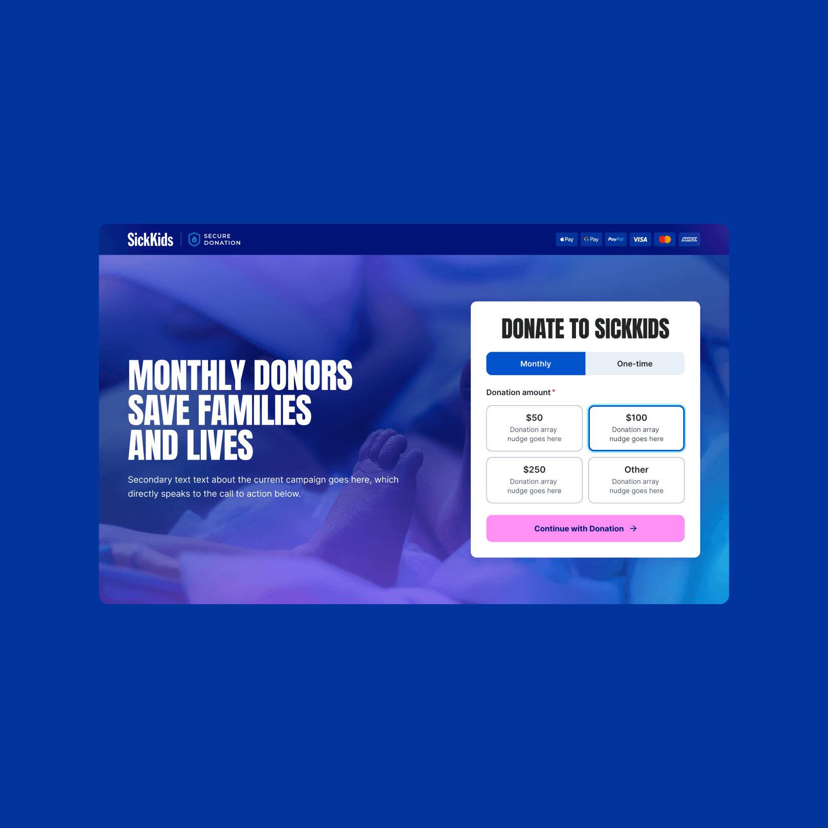
Case Study Preview
SickKids
Using the Atomic Design methodology, we created a fully accessible web design system for the SickKids VS campaign, ensuring compliance and flexibility across pages. When their brand updated a year later, our system made reskinning simple and efficient with no need to start over.