Compass provides free mental health services for children, youth, and their families in a safe and confidential space. After undergoing a full rebrand and an office renovation, Compass required new signage to help visitors easily locate the space they’re looking for. We design an accessible wayfinding system that creates a welcoming atmosphere.
AODA Compliant
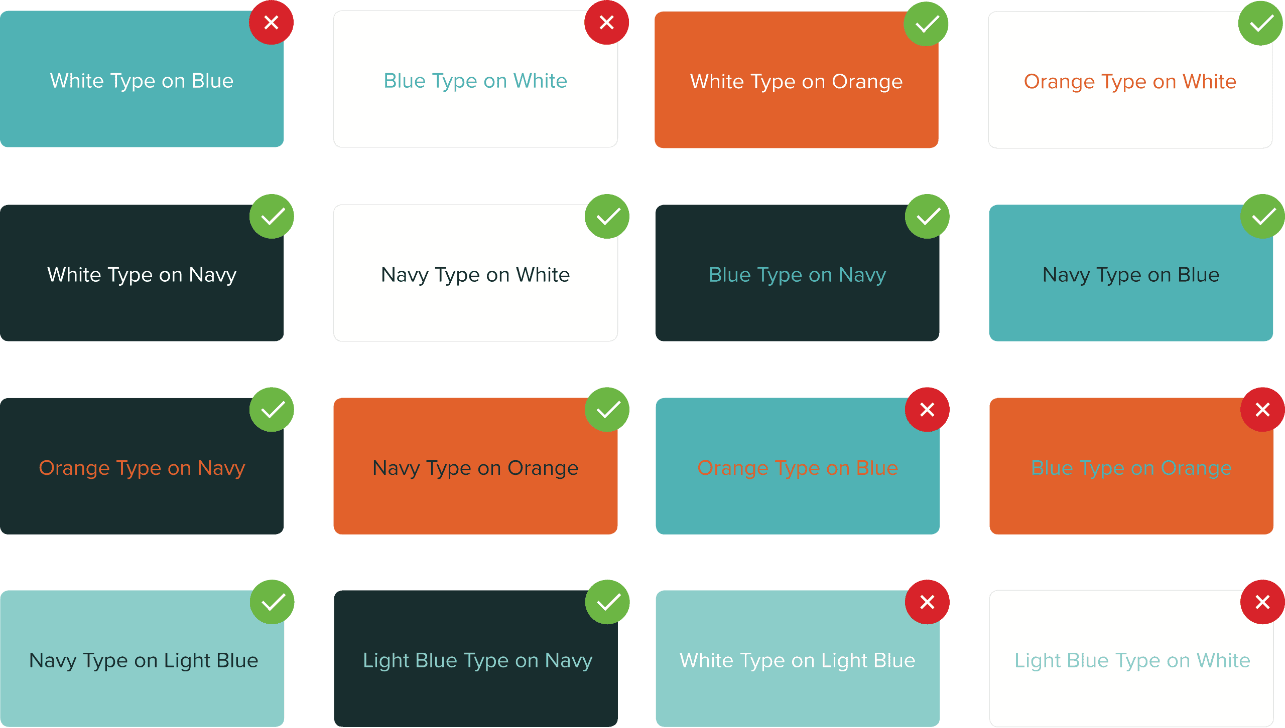
As a public sector business, Compass is required to have a wayfinding system that is AODA (Accessibility for Ontarians with Disabilities Act) compliant. The AODA establishes the requirement for accessible environmental graphic design. As a starting point, we reviewed the brand colours and tested them together for compliance. A minimum of 10:1 contrast ratio is recommended for compliance. This test allowed us to narrow down the colour combinations that would work.

Directional Signage
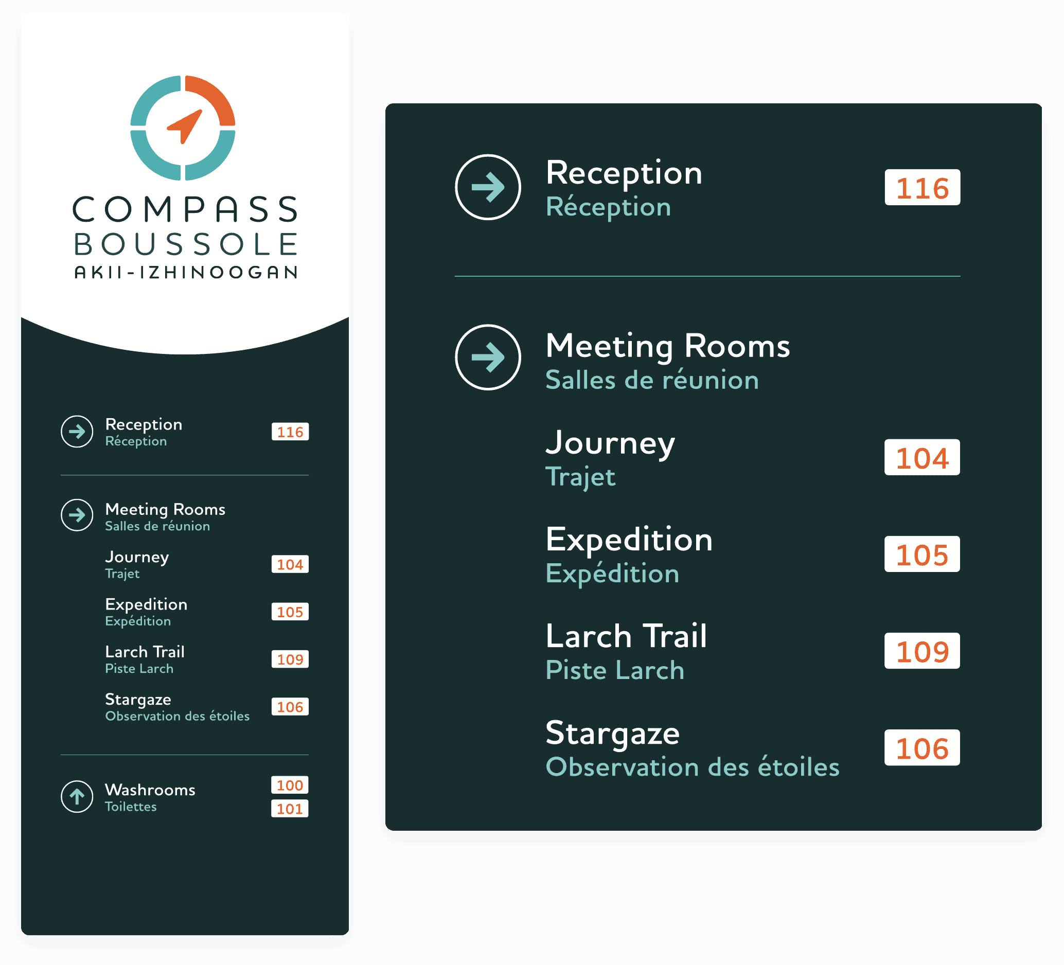
Nobody likes to feel lost. Directional signage was placed throughout the office to help visitors find their way, build confidence and feel welcomed. Compass shares an office building with multiple tenants, which made it important to showcase their logo to indicate that visitors are in the right place. We presented the logo in full colour on white to retain the highest contrast ratio. For consistency, the same version of the logo was used for all wayfinding signage
On the lower half, the use of the reverse navy provided the necessary contrast for important room information. For AODA compliance and to clearly indicate direction a standard arrow pictogram was used. The room numbers have been popped in white for quick identification.

Room Identification / Braille
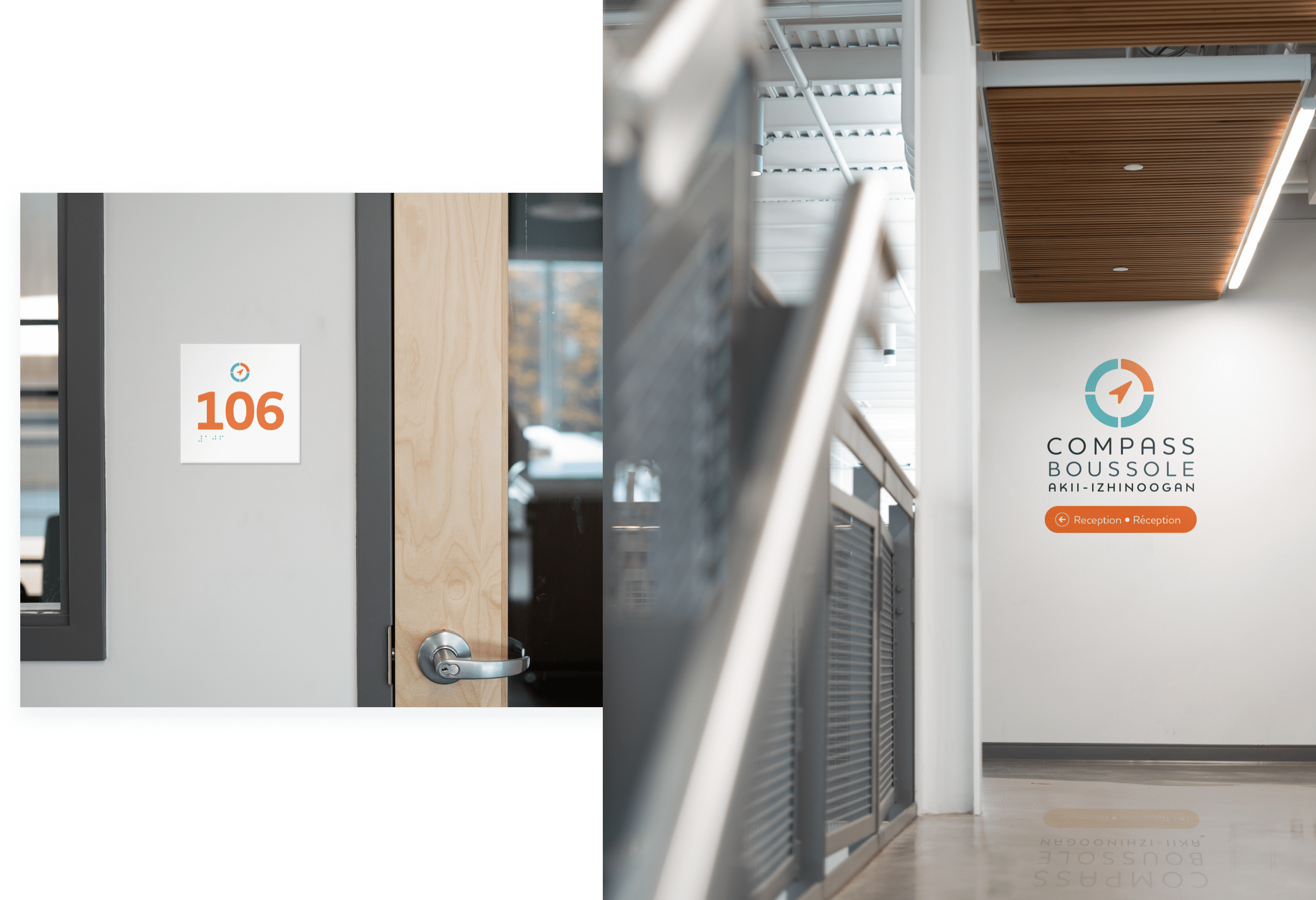
To ensure people with limited to no vision could easily navigate through the office, braille was paired with the room number. The requirements for braille require special placement and spacing. We left 10 mm of space between graphic elements to ensure readability. Additionally, all signs were placed 1,500 mm above the floor and 140 mm from the doorjamb.
