For over 30 years Domite® has proven its durability and value to the mining and material handling industries throughout the world by supplying premium wear-resistant material. They liked their logo but wanted to create a cohesive brand that showcased their history but in a modern fashion.


Understanding Brand Refinement
A brand refinement differs from a re-brand in that we are not starting over. In contrast, a brand refinement aims to inventory what you are currently doing, what is working, and what isn’t.
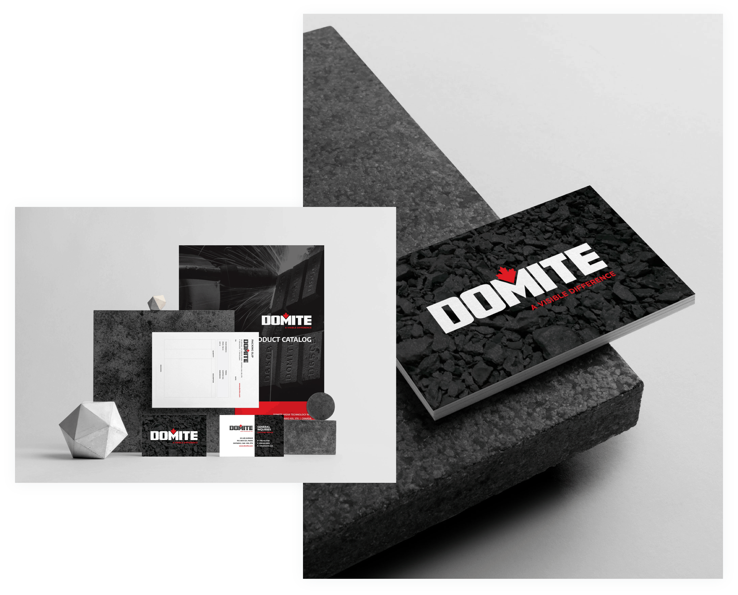
Over the years, the Domite® brand became fractured. We reviewed their brand, modernize their logo and visual elements and developed a new plan for logo usage, which takes into account the current applications of their logo.

A Polished Brand
Domite® liked the direction their brand was taking but wanted some polish to make sure that it would stand out in the marketplace. We worked with them to understand what was working about the existing brand, and explored where they wanted to be in the future to develop a new brand image that would speak to who they are, what they stand for and reflect their future business goals.

Made Canadian Strong
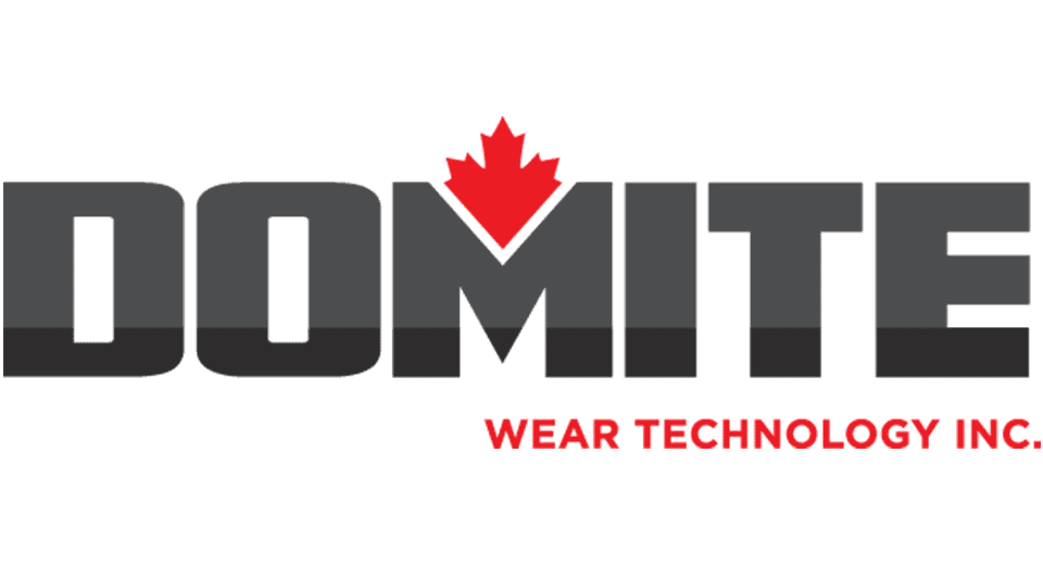
The new mark was designed to mimic the strength of their product with a bold typeface. The maple leaf was repositioned to the heart of the logo, representing their pride to be a Canadian made product. For the colouring, we used two tones of grey to symbolize their unique mix of Chrome White Iron and Mild Steel backing.

Building a Cohesive Brand
As an industrial company, Domite® required visual brand elements that would work just as hard as their wear products. We illustrated their products to work easily in tough industrial applications. To show the versatility of their product line we illustrated graphics that highlight their use, the red indicates where the wear parts can be used in industrial applications.
Alternative outline product illustrations were created to showcase the different product variations and they can be used in print and online applications.